
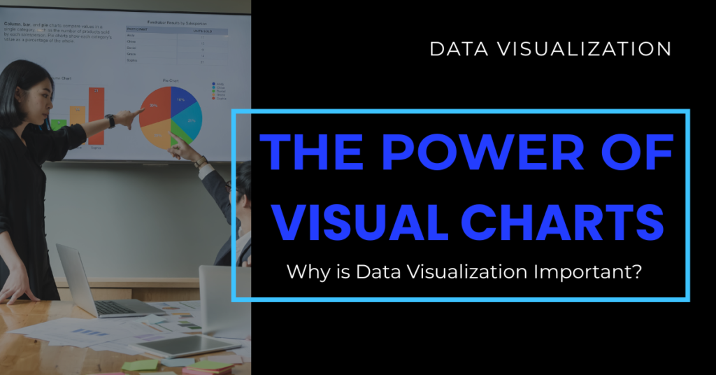
Data Visualization: What is Data Visualization?
Introduction:
In the digital age, we swim in oceans of data daily, sales figures, website clicks, survey results, and more. But raw data is like an unassembled puzzle. Until we put the pieces together visually, we miss the bigger picture.
Data visualization turns this puzzle into clear, colorful charts and dashboards that tell stories. It’s the secret weapon behind smart decisions in business, healthcare, education, and even daily life.
In this blog, we’ll explore what data visualization is, why it matters, popular data visualization tools, different types, and tips to visualize data effectively, whether you’re using Excel, Power BI, Tableau, or Python visualization libraries.
What is Data Visualization?
Data visualization is the practice of converting raw data into visual formats, such as graphs, charts, and maps. It helps people see patterns, trends, and outliers that would be hidden in spreadsheets.
Good visuals can explain complex ideas at a glance. They make data more accessible, understandable, and shareable.
Why is Data Visualization Important?
Here’s why clear visuals are crucial:
- Simplify complex data: It turns large and complicated datasets into charts or graphs
- Identify trends and patterns: It allows you to clearly see trends, unusual values, or changes over time that might be missed in raw data.
- Support decisions: Visuals provide clear evidence that helps teams make informed, confident choices.
- Communicate findings: Share insights with clients, teammates, or the public.
Without visuals, data stays locked away in tables and its full value is lost.
Popular Data Visualization Tools
Microsoft Excel
Despite its age, Microsoft Excel remains indispensable for quick exploratory visuals and lightweight reporting. It is unmatched for rapid prototyping when time is tight.
Example: If I need to validate initial sales data for a regional manager, a simple column chart in Excel instantly highlights which product lines are underperforming. Pivot charts and conditional formatting add extra flexibility without any need for coding.
Power BI
Power BI visualization excels at building enterprise-level interactive dashboards that update automatically. Its deep integration with Microsoft services makes it a solid choice for organizations that rely on the Microsoft ecosystem.
Example: For a retail client, we linked Power BI to a live sales database. Regional managers could check daily performance on their tablets, drill down by product or store, and share insights with their teams on the go.
Tableau
When the goal is to craft visually rich dashboards that encourage exploration, Tableau is my preferred choice. It handles large datasets gracefully and is intuitive for users with minimal technical background.
Example: For a nationwide retailer, we designed an executive dashboard in Tableau that tracked footfall, conversion rates, and seasonal sales trends. Executives could click on a store location and instantly access detailed historical and predictive insights.
Python Visualization Libraries
For flexible, programmable visuals especially in AI and machine learning projects, Python is my go-to. Its libraries provide full control and automation.
Key Python libraries and practical use cases:
- Matplotlib: The foundation for creating reliable basic plots, like tracking a model’s training loss over time.
- Seaborn: Adds beauty and simplicity for statistical plots, such as heatmaps to reveal feature correlations during data exploration.
- Plotly and Bokeh: Excellent for building interactive, web-friendly visuals, such as apps where stakeholders adjust model inputs and instantly see updated predictions.
When automation, customization, and integration with AI pipelines matter most, Python and data visualization remain unmatched.
Comparative Table: Excel vs Power BI vs Tableau vs Python for Data Visualization
| Feature | Excel | Power BI | Tableau | Python |
|---|---|---|---|---|
| Ease of Use | Very easy; ideal for quick, simple visuals and ad-hoc reporting | Easy; user-friendly drag-and-drop interface with seamless integration in Microsoft ecosystem | Easy to moderate; intuitive for creating interactive, visually rich dashboards | Requires coding knowledge; flexible but has a learning curve |
| Type of Visuals | Basic charts (bar, line, pie, scatter); limited interactivity | Advanced dashboards, real-time interactive reports | Highly polished interactive dashboards and advanced analytics | Fully customizable plots; static or interactive; supports complex, custom visuals |
| Data Volume Handling | Suitable for small to medium datasets | Handles large datasets well; connects to various sources; supports live data | Handles large datasets efficiently; optimized for big data exploration | Excellent for any data size; performance depends on how code and libraries are used |
| Collaboration & Sharing | Easy sharing via Excel files or Office 365 | Strong collaboration; integrates with Teams, SharePoint, and cloud services | Easy publishing and sharing via Tableau Server or Tableau Public | Requires additional setup for sharing (e.g., web apps with Flask/Dash, or reports exported manually) |
| Automation & Integration | Limited automation (macros, VBA) | Strong integration with Microsoft tools and cloud services | Good integration with databases and cloud sources | Highly automatable; integrates with ML pipelines, APIs, and notebooks |
| Best Use Case | Quick exploratory data checks, basic reporting | Business intelligence dashboards, real-time KPI tracking, executive reporting | Visual storytelling, interactive reports for presentations and business insights | Research, custom analytics, machine learning visualizations, automated reporting |
Common Data Visualisation Charts Types
Picking the right chart is crucial because it can highlight insights or hide them. Here is my practical breakdown with real-world examples that I share with junior analysts:
Bar Charts: Best for comparing discrete categories.
Example: Comparing yearly revenue by region.

Line Charts: Ideal for showing changes or trends over time.
Example: Plotting website traffic growth by year.

Pie Charts: Use sparingly and only when showing simple parts of a whole.
Example: Visualizing market share for three key competitors

Scatter Plots: Reveal relationships or correlations between two numeric variables.
Example: Analyzing the relationship between marketing spend and customer acquisition cost.

Heatmaps: Excellent for visualizing data density or feature correlations.
Example: Displaying correlation among variables to detect multicollinearity.

Dashboards: Combine multiple visuals for a complete, real-time overview.
Example: A sales dashboard showing revenue trends, conversion funnels, and product performance on a single interactive page for managers.

How to Visualize Data Effectively
Visuals can clarify or confuse. The difference comes down to execution. Over my years mentoring teams, I always share these principles for impactful visual communication:
- Clarity first: Remove clutter and unnecessary elements. Let the data stand out.
- Proper labeling: Make every axis, unit, and legend clear and self-explanatory.
- Match the chart to the story: Select visuals that align with what the data needs to say.
- Use color wisely: Highlight key insights without overwhelming the viewer.
- Test with fresh eyes: Have someone unfamiliar with the raw data check your visuals for clarity.
A good visualization answers a question immediately. A great one inspires new questions that lead to deeper discovery.
Conclusion: Make Data Work for You
Data is powerful, but only when people understand it. With the right data visualization tools and skills, anyone from students to a certified data scientist can turn confusing numbers into visuals that drive real-world action.
Whether you’re working on reports in Excel, building a Power BI visualization, designing dashboards in Tableau, or learning data visualisation Python basics, remember: good visuals don’t just show data, they tell a story.
If you’re looking for a clear, guided, and mentor-led pathway, INTTRVU.AI offers structured Data Science & AI Certification Program with everything from basics to job preparation. Whether you’re a fresher or working professional, this is your chance to stand out.
FAQs
Data visualization means turning raw data into visual charts and graphs to make it easy to understand trends and patterns.
Popular tools include Microsoft Excel, Power BI visualization, Tableau, and Python visualization libraries like Matplotlib and Seaborn.
It simplifies complex data, helps spot trends, supports decision-making, and makes it easy to share insights with others.
Start with basic Python tutorial visualization resources, practice with Matplotlib and Seaborn, and build small projects to gain confidence. Enroll in a course check out INTTRVU.AI, which offers a comprehensive Data Science and AI Certification Program.
Common types include bar charts, line charts, pie charts, scatter plots, heatmaps, and interactive dashboards.